I have long browsed the Winnipeg Building Index (WBI), and have enjoyed the information and photos presented. I thought it would be interesting to see the information contained inside of it presented in a more visual way, e.g. in a plot, on a map. The end goal I had in mind was an animated heatmap of the geographic coordinates of the buildings in the index by decade. The idea behind the entire exercise was to practice web scraping and data visualization.
To collect the data, I used Python and a web scraping library called Beautiful Soup.
#Richard Bruneau, 2015
#Omnigatherum.ca

from bs4 import BeautifulSoup
import urllib2
import unicodedata
import re

baseURL = "http://wbi.lib.umanitoba.ca/WinnipegBuildings/showBuilding.jsp?id="
DELIM = ";"

f = open("wbi_data.csv", "w")

#Range is 6 to 3303
for x in range(6,3304):
    url = baseURL + str(x)
    html = urllib2.urlopen( url ).read()
    soup = BeautifulSoup(html)
    soup.prettify()

    table = soup.find("table")

    if (table):
        cells = table.find_all("td")
        cellList = []

        #cell is type: bs4.element.Tag
        for index, cell in enumerate(cells):
            string = unicodedata.normalize('NFKD', cell.decode()).encode('ascii','ignore')
            string = re.sub(r'<.*?>', '', string) #remove HTML
            string = re.sub(r'\s+', ' ', string) #remove extra whitespace
            string = string.replace('\n', '').replace(':', '').replace('.', '') #remove newlines, etc
            string = string.strip(' ') #remove extra whitespace at start/end of string
            cellList.append(string)

        vals = range(0,len(cellList))[::2]

        name, address, year = "","",""

        for i in vals:
            if (cellList[i] == "Name"):
                name = cellList[i+1]
            if (cellList[i] == "Address"):
                address = cellList[i+1]
            if (cellList[i] == "Date"):
                year = cellList[i+1]

        print( str(x) + DELIM + name + DELIM + address + DELIM + year )
        f.write( str(x) + DELIM + name + DELIM + address + DELIM + year + "\n"  )

f.close()

print("\nEnd of Processing")
Once the data was collected, it was cleaned up. For example, there were many different year formats present in the approximately 2550 items collected:
- 1906 (circa)
- 1905 – 1906
- 1950-1951
- 1903 (1912?)
- 1908?
- 1885, 1904
- 1946-
- 1880s
- 1971 circa
For years, the last complete (4 digits) and plausible (1830 < year < 2015) year found was used as the year for each building. Addresses were slightly less varied. For example, most suitable addresses (i.e. geocodable) took the form of “279 Garry Street” or “Main Street at Market Avenue” – simply a street (e.g. “Colony Street”) in the address column was removed. There were also a few addresses that don’t appear to actually exist. (The names of buildings aren’t important for this stage – though, they will be for a later project.) Once the data was cleaned up, it was saved again as a CSV file.
As there are a number of things that can be done with this data, I decided to do a simple task at first. Since most buildings had years associated with them, I decided to visualize the number of buildings in the WBI for each decade. To do this, I imported the ‘year’ column into plot.ly and used the histogram plot type. After that, I created 19 ‘buckets’ corresponding to each decade from the 1830s to 2010s. The result is below:
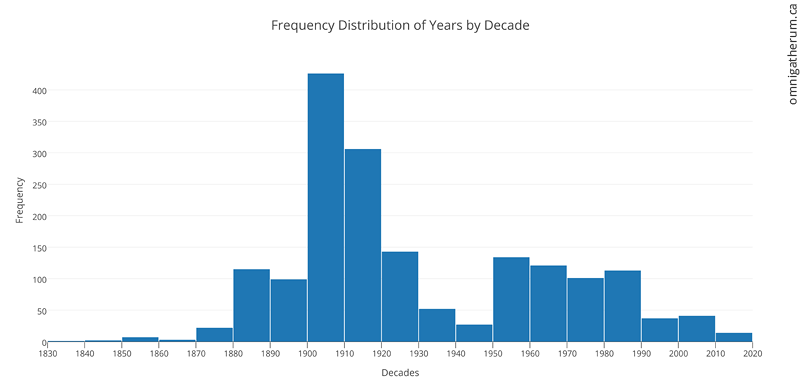
Frequency Distribution of Years by Decade – made in plot.ly
There are other interesting things that can be determined. For example, the most common streets that appear in the WBI. To find that out, I wrote a simple script that removed numbers from addresses, added them to a Counter object, and then used the most_common() method to determine the most common streets. The result is below (the legend is ordered, with Main Street being the most common):
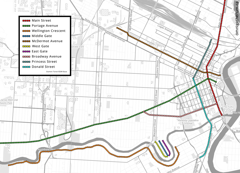
The ten most common streets in the resulting dataset (most common is at the top).
Following this, I imported the data into QGIS as a csv file using MMQGIS. Once loaded, the addresses were then geocoded using the Google Maps API (via MMQGIS). Geocoding is a somewhat slow process at about 160 addresses processed per minute. The result was a shapefile layer:
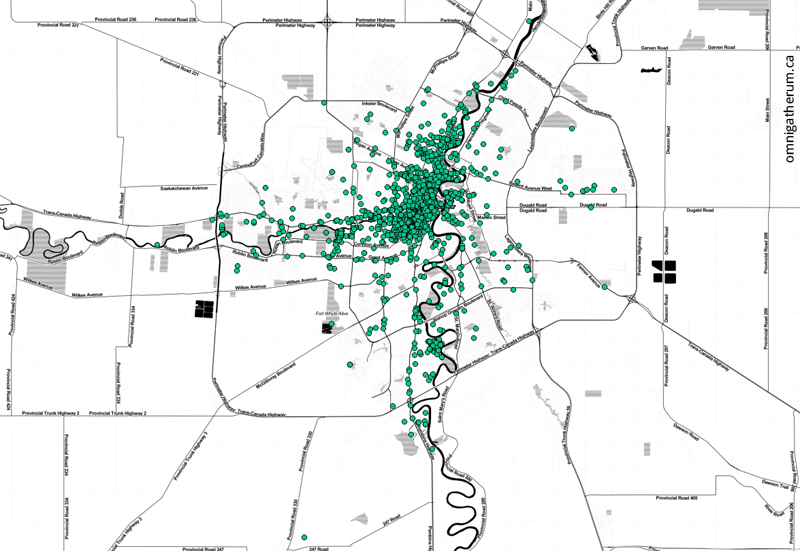
All geocoded points, over a Stamen Toner base map.
The points have a large amount of overlap, which means the above image does not give a good sense of the actual density of building locations. To visualize density, I used QGIS to create a heatmap from the shapefile layer. The result is below (red areas are higher density):
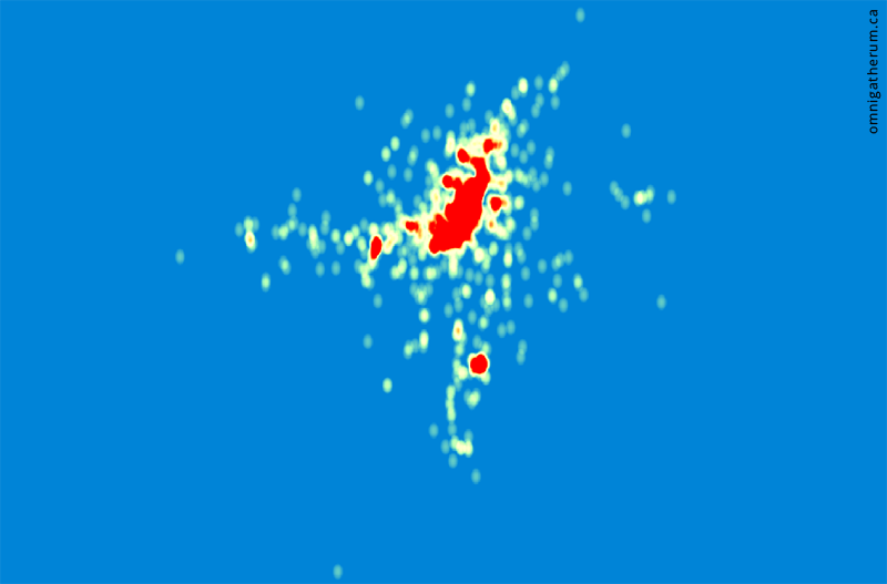
A heatmap of all points.
And as an overlay over the points themselves on a map of Winnipeg:
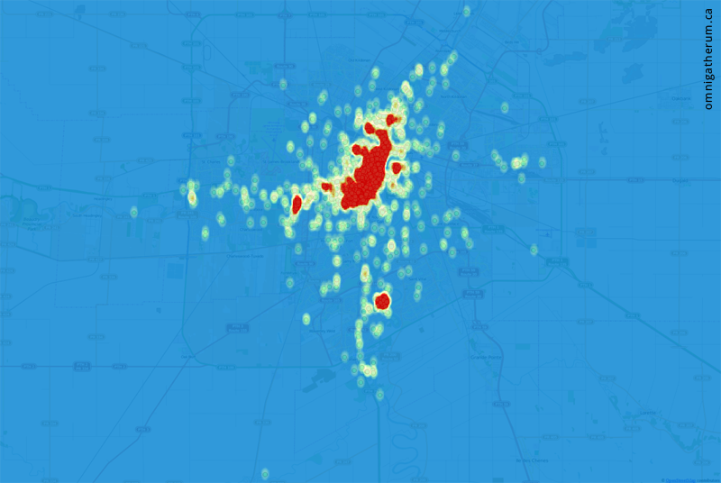
A heatmap of all points overlaid over the original points.
With the data loaded into QGIS, I was also able to answer other questions – for example, determining the highest density areas. To do that I drew polygons in the densest areas (as seen in the heatmap) and used the ‘Points in polygon’ tool to count the total number of points (geocodable addresses) that were inside. Some of the highest density areas were:
- Exchange District – 146 addresses*
- Armstrong Point – 121 addresses
- University of Manitoba – 65 addresses
(*using the boundaries for the National Historic Site)
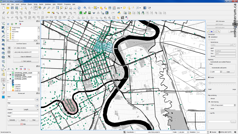
Adding polygons for counting points.
The last task was to create the animated heatmap. To do that, the years associated with each point (geocoded address) were categorized by decade (i.e. 1830-1839, 1840-1849, etc) and assigned a decade code (0-18). After that, separate layers were made for each decade using the query builder (that is, a set of points associated with each decade code). After that, a heatmap was produced for each layer and exported as an image. The exported images were imported into Adobe Premiere Pro and animated. The resulting video is the following:
Links:
Winnipeg Building Index: http://wbi.lib.umanitoba.ca/WinnipegBuildings/
Beautiful Soup: http://www.crummy.com/software/BeautifulSoup/
QGIS: http://qgis.org/
MMQGIS: http://michaelminn.com/linux/mmqgis/
plot.ly: http://plot.ly/
Web Scraping: http://en.wikipedia.org/wiki/Web_scraping
Stamen Toner map: http://maps.stamen.com/toner/