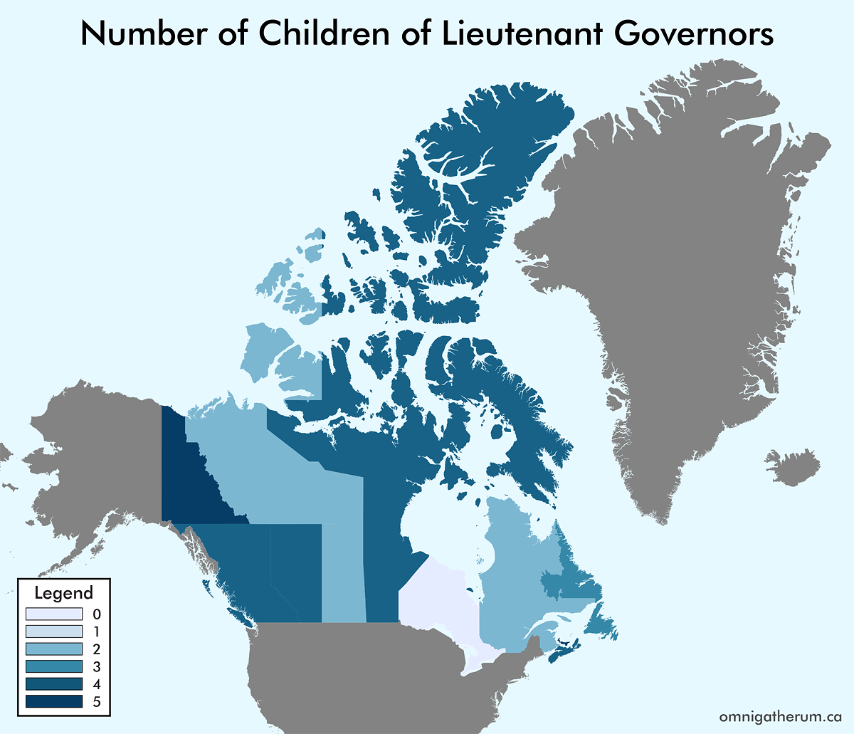
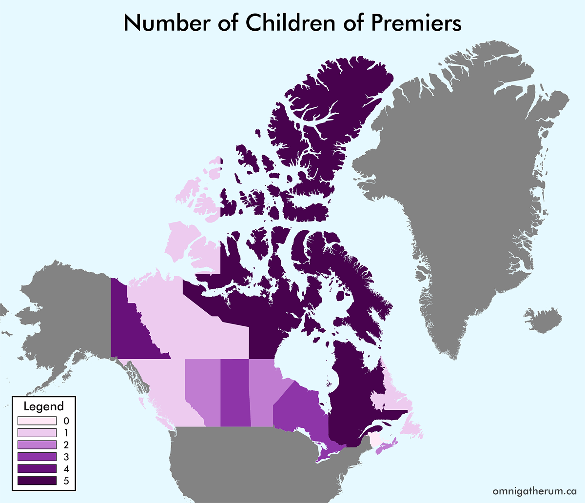
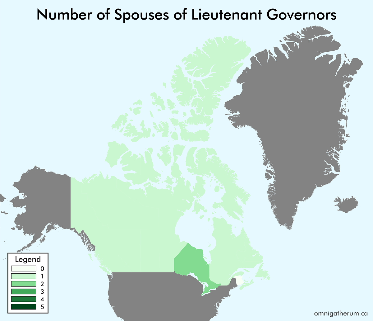
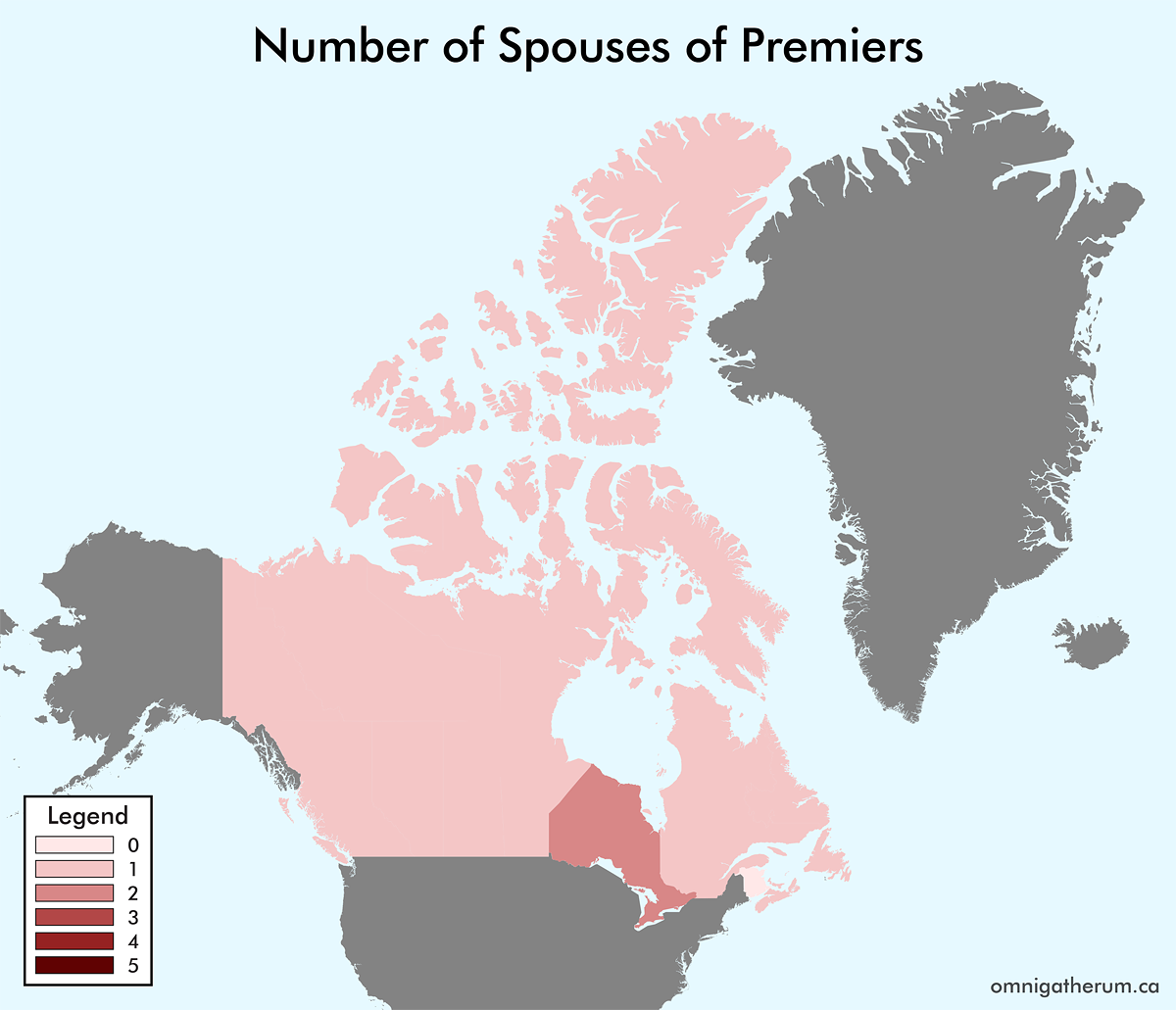
As a continuation of the previous post, Maps of the World by Number of Children and Number of Spouses of Leaders, I have made a set of maps for the Canadian provinces and territories. The process I followed here was similar to that of the previous post. One major difference between the two sets of maps is that data on Canadian lieutenant governors and premiers is a lot easier to find. For the sake of simplicity I have included the territorial commissioners (for Yukon, Northwest Territories, and Nunavut) under the count for “lieutenant governors” – they are not, though, representatives of the monarch (Queen Elizabeth II).
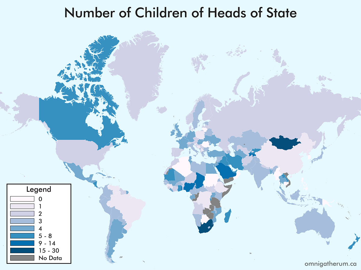
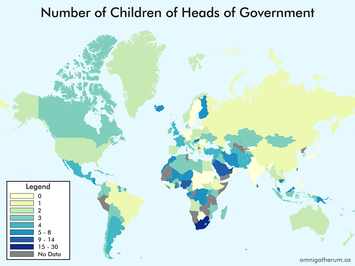
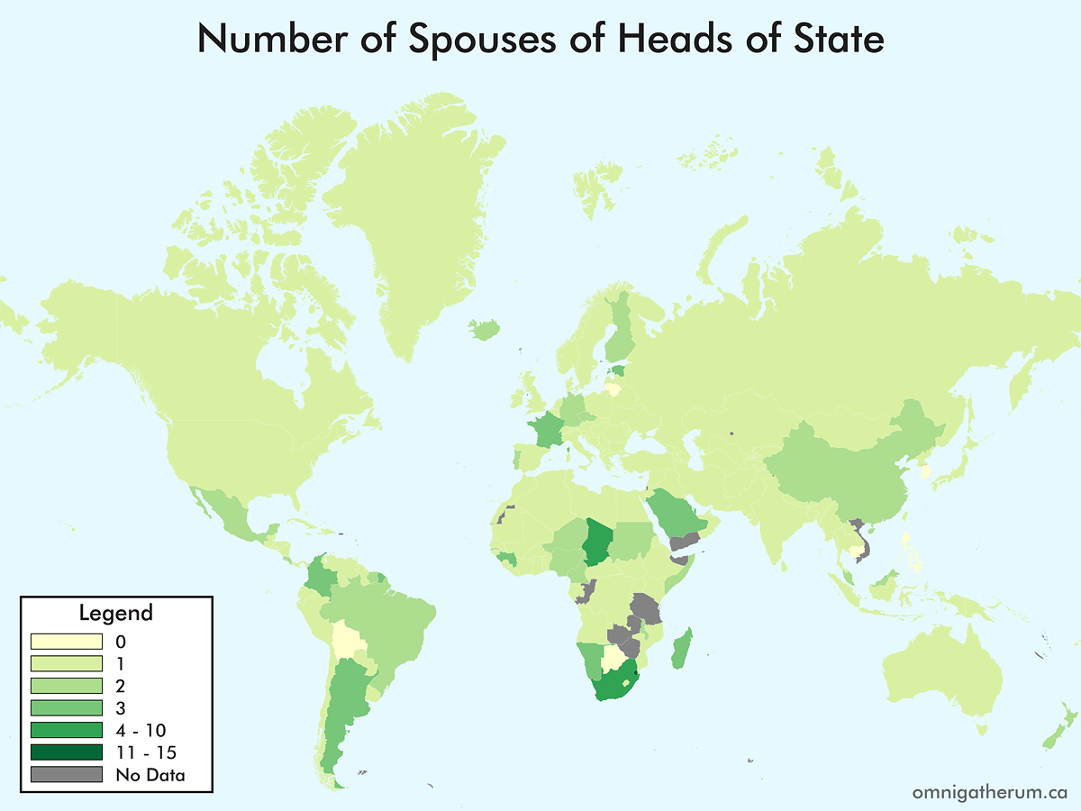
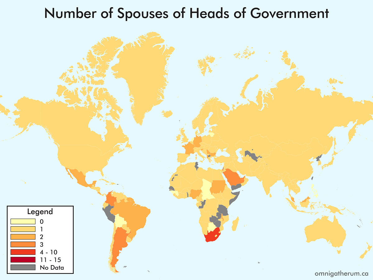
One map that I have not seen – and could not seem to find, having looked for it – is a map of the world’s countries by the number of children of the heads of government. Previous (similar) maps that I have come across include educational backgrounds, religious views, and age of leaders. In deciding to make such a map, I broadened the task to that of children and spouses, and for both heads of government and heads of state. Given that world leaders, on the whole, change frequently, I decided to ‘freeze’ the selection of leaders as it was on April 20th, 2016.
For Commonwealth nations, the Governor General was selected as the head of state, instead of Queen Elizabeth II. This was mainly to avoid having Elizabeth II’s spouse and children counts repeated. In general, when multiple choices existed for a head of state or head of government, I selected the person that appeared the fewest times elsewhere. When counting spouses, a person’s domestic partner(s) and spouses were counted together. This combination of counts occurred for about nine leaders. When counting children, adopted children were included in the count.
Selecting a head of state and head of government was not entirely straightforward. There were several countries whose leadership situations were atypical, for example: Andorra (Joan Enric Vives Sicília, the Episcopal Co-Prince, was chosen since François Hollande is president of France); Bosnia and Herzegovina (the Chairman, Bakir Izetbegović, was chosen for head of state, and Denis Zvizdić was chosen for head of government); China (Xi Jinping was chosen for head of state and Li Keqiang was chosen for head of government); North Korea (Kim Jong-un was chosen for head of state and Pak Pong-ju was chosen for head of government); San Marino (Massimo Andrea Ugolini was chosen for head of state and Gian Nicola Berti was chosen for head of government); Switzerland (the president of the Swiss Federal Council, Johann Schneider-Ammann, was chosen for both positions); Vietnam (Trần Đại Quang was chosen for head of state and Nguyễn Xuân Phúc was chosen for head of government).
I then created a Python script with the Beautiful Soup 4 library to scrape the relevant data from each Wikipedia URL. There were a fair amount of leaders whose (English) Wikipedia pages did not contain the needed information. I referred also to other Wikipedia languages (particularly the ones in the official language(s) of the relevant country), but did not gain much.
The next step in gathering the data was using the (now-deprecated) Freebase API. The process was simpler than dealing with Wikipedia, as Freebase, a graph-structured database, was designed with computer-readability in mind.
The two collections of data – from Wikipedia and Freebase – were combined into a new dataset. The highest value (from either Wikipedia or Freebase) for number of spouses and number of children of each leader was used. I also used crowd-sourcing for a randomly selected subset of leaders to check that the previous two sources were accurate (they were). In addition, I manually searched for data on 45 leaders.
The program used to create the maps was TileMill, a program by MapBox. The process of creating these maps, aside from collecting the data, was fairly straightforward as the only step required to represent the data was to colour each country according to the data (or rather, selected divisions for that data).
The colour palettes for the four maps were created using Color Brewer. A Python script, which read through each of the four relevant columns in the dataset CSV file, was used to create the CartoCSS code for styling the TileMill map (i.e. specifying colours for each country). The script used the ISO 3166-1 alpha-3 country codes that were identified earlier. To assign a particular colour to a country in TileMill, the ISO 3166-1 alpha-3 country code can be used. For example, to colour Greenland red, the appropriate CartoCSS would be:
[ADM0_A3='GRL'] {
   polygon-fill: #ff0000;
}
Once that process is complete, the resulting maps are:
I have long browsed the Winnipeg Building Index (WBI), and have enjoyed the information and photos presented. I thought it would be interesting to see the information contained inside of it presented in a more visual way, e.g. in a plot, on a map. The end goal I had in mind was an animated heatmap of the geographic coordinates of the buildings in the index by decade. The idea behind the entire exercise was to practice web scraping and data visualization.
To collect the data, I used Python and a web scraping library called Beautiful Soup.
#Richard Bruneau, 2015
#Omnigatherum.ca

from bs4 import BeautifulSoup
import urllib2
import unicodedata
import re

baseURL = "http://wbi.lib.umanitoba.ca/WinnipegBuildings/showBuilding.jsp?id="
DELIM = ";"

f = open("wbi_data.csv", "w")

#Range is 6 to 3303
for x in range(6,3304):
    url = baseURL + str(x)
    html = urllib2.urlopen( url ).read()
    soup = BeautifulSoup(html)
    soup.prettify()

    table = soup.find("table")

    if (table):
        cells = table.find_all("td")
        cellList = []

        #cell is type: bs4.element.Tag
        for index, cell in enumerate(cells):
            string = unicodedata.normalize('NFKD', cell.decode()).encode('ascii','ignore')
            string = re.sub(r'<.*?>', '', string) #remove HTML
            string = re.sub(r'\s+', ' ', string) #remove extra whitespace
            string = string.replace('\n', '').replace(':', '').replace('.', '') #remove newlines, etc
            string = string.strip(' ') #remove extra whitespace at start/end of string
            cellList.append(string)

        vals = range(0,len(cellList))[::2]

        name, address, year = "","",""

        for i in vals:
            if (cellList[i] == "Name"):
                name = cellList[i+1]
            if (cellList[i] == "Address"):
                address = cellList[i+1]
            if (cellList[i] == "Date"):
                year = cellList[i+1]

        print( str(x) + DELIM + name + DELIM + address + DELIM + year )
        f.write( str(x) + DELIM + name + DELIM + address + DELIM + year + "\n"  )

f.close()

print("\nEnd of Processing")
Once the data was collected, it was cleaned up. For example, there were many different year formats present in the approximately 2550 items collected:
1906 (circa)
1905 – 1906
1950-1951
1903 (1912?)
1908?
1885, 1904
1946-
1880s
1971 circa
For years, the last complete (4 digits) and plausible (1830 < year < 2015) year found was used as the year for each building. Addresses were slightly less varied. For example, most suitable addresses (i.e. geocodable) took the form of “279 Garry Street” or “Main Street at Market Avenue” – simply a street (e.g. “Colony Street”) in the address column was removed. There were also a few addresses that don’t appear to actually exist. (The names of buildings aren’t important for this stage – though, they will be for a later project.) Once the data was cleaned up, it was saved again as a CSV file.
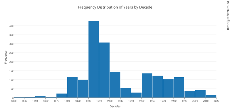
As there are a number of things that can be done with this data, I decided to do a simple task at first. Since most buildings had years associated with them, I decided to visualize the number of buildings in the WBI for each decade. To do this, I imported the ‘year’ column into plot.ly and used the histogram plot type. After that, I created 19 ‘buckets’ corresponding to each decade from the 1830s to 2010s. The result is below:
Frequency Distribution of Years by Decade – made in plot.ly
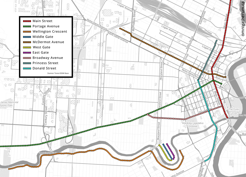
There are other interesting things that can be determined. For example, the most common streets that appear in the WBI. To find that out, I wrote a simple script that removed numbers from addresses, added them to a Counter object, and then used the most_common() method to determine the most common streets. The result is below (the legend is ordered, with Main Street being the most common):
The ten most common streets in the resulting dataset (most common is at the top).
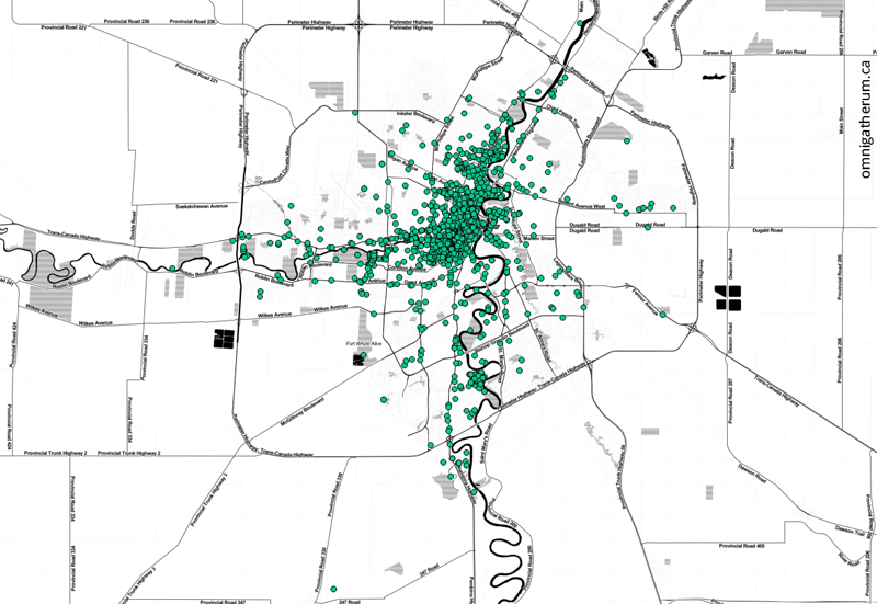
Following this, I imported the data into QGIS as a csv file using MMQGIS. Once loaded, the addresses were then geocoded using the Google Maps API (via MMQGIS). Geocoding is a somewhat slow process at about 160 addresses processed per minute. The result was a shapefile layer:
All geocoded points, over a Stamen Toner base map.
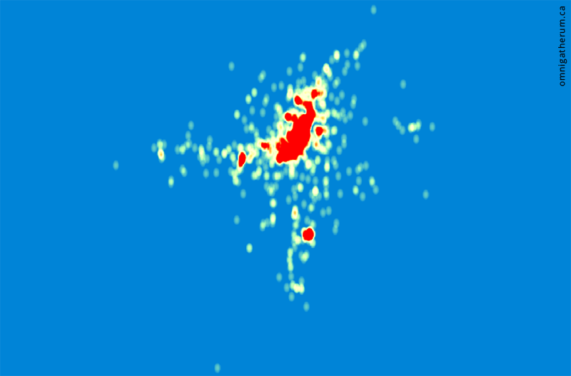
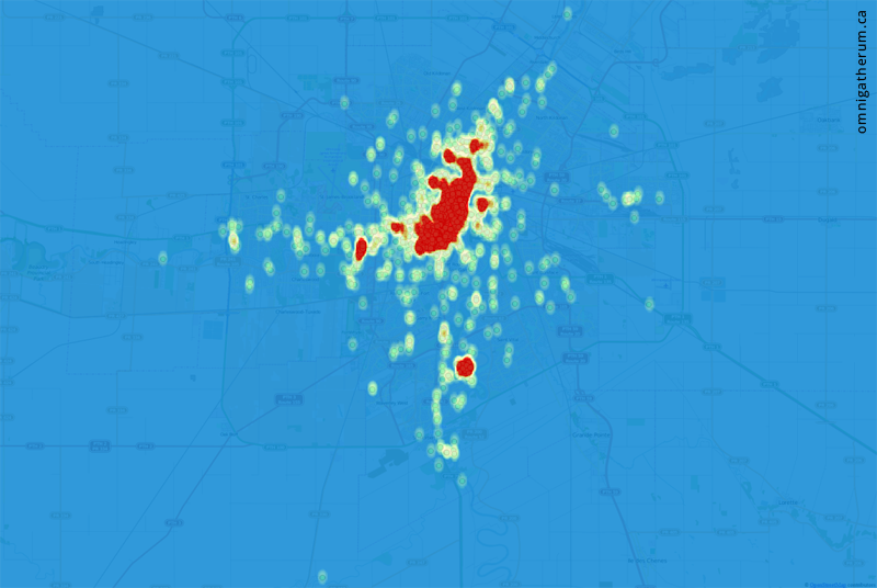
The points have a large amount of overlap, which means the above image does not give a good sense of the actual density of building locations. To visualize density, I used QGIS to create a heatmap from the shapefile layer. The result is below (red areas are higher density):
A heatmap of all points.
And as an overlay over the points themselves on a map of Winnipeg:
A heatmap of all points overlaid over the original points.
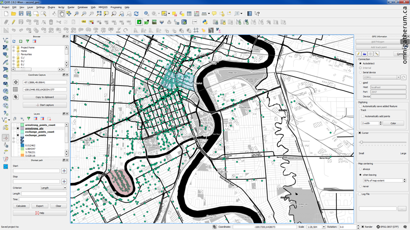
With the data loaded into QGIS, I was also able to answer other questions – for example, determining the highest density areas. To do that I drew polygons in the densest areas (as seen in the heatmap) and used the ‘Points in polygon’ tool to count the total number of points (geocodable addresses) that were inside. Some of the highest density areas were:
Exchange District – 146 addresses*
Armstrong Point – 121 addresses
University of Manitoba – 65 addresses
(*using the boundaries for the National Historic Site)
Adding polygons for counting points.
The last task was to create the animated heatmap. To do that, the years associated with each point (geocoded address) were categorized by decade (i.e. 1830-1839, 1840-1849, etc) and assigned a decade code (0-18). After that, separate layers were made for each decade using the query builder (that is, a set of points associated with each decade code). After that, a heatmap was produced for each layer and exported as an image. The exported images were imported into Adobe Premiere Pro and animated. The resulting video is the following: